
- Joined
- Jun 13, 2017
- Messages
- 3,324
- Motherboard
- Gigabyte A520i AC
- CPU
- Ryzen 7 4700G
- Graphics
- Radeon Vega 8
- Mac
- Classic Mac
- Mobile Phone
It's the simple things!...

Last edited:
This thread was never intended to document macOS bugs that have never been addressed. It was broken off from another thread that was going off topic. Only a discussion of how the graphics in OS X / macOS have changed in the past 8 years. We can complain all we want about anything Apple does or doesn't fix, in the end it makes no difference. They don't monitor these forums and respond to anything we gripe about.I could go on with a list of 5 obscene bugs in latest OS that have been around for generations, and my phone just does crazytown with certain input situations. UI race conditions and strange behaviors are too common and gross old bugs never get fixed. Try writing feedback to Apple for a pointless activity.
I liked the shiny pill style era best, circa 2010-2012. Looked nice, and made the difference between plain text items and something you could click on clear. Nowadays, it's all dark and grey and low contrast. Bah.The design language of OS X / macOS has changed significantly since 2014 when Yosemite gave us our first OS X version to borrow heavily from iOS. The dock went from 3D to 2D and became flat again, some icons changed completely, moving away from the abundant skeuomorphism in past OS X versions. In this thread you can voice your opinions about what you like from past versions compared to what we have now in Monterey/Ventura.
This iTunes 12.2 icon with the color gradient is my favorite iTunes icon of all time. Now it's just red, kind of like the 2014 12.0 version but in the "rounded square" treatement that all of them get today.
View attachment 552053
Was glad when they got rid of the CD icon many years ago.
View attachment 552054
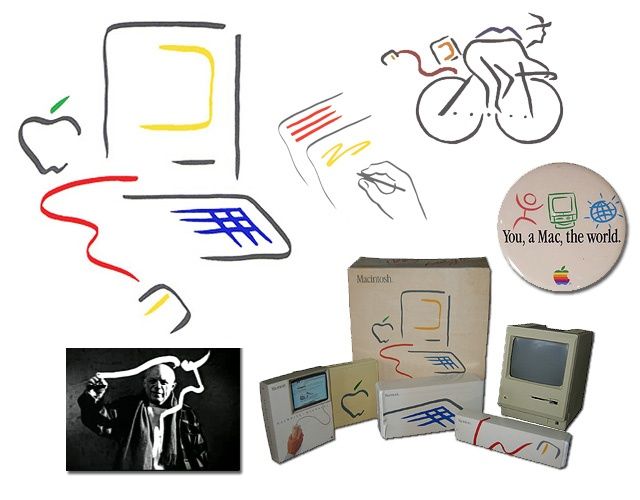
Over the years Apple has lost that 'Cool' factor, they're becoming, dare I say it... Boring!. The 'Picasso' style branding is iconic and related products can now fetch thousands on eBay.
View attachment 552505
Enjoy the Timeless Appeal of Apple's Picasso Artwork [Gallery]
The famous Macintosh Picasso logo was developed for the introduction of the original 128k Mac back in 1984. A minimalist line drawing in the style ofwww.cultofmac.com
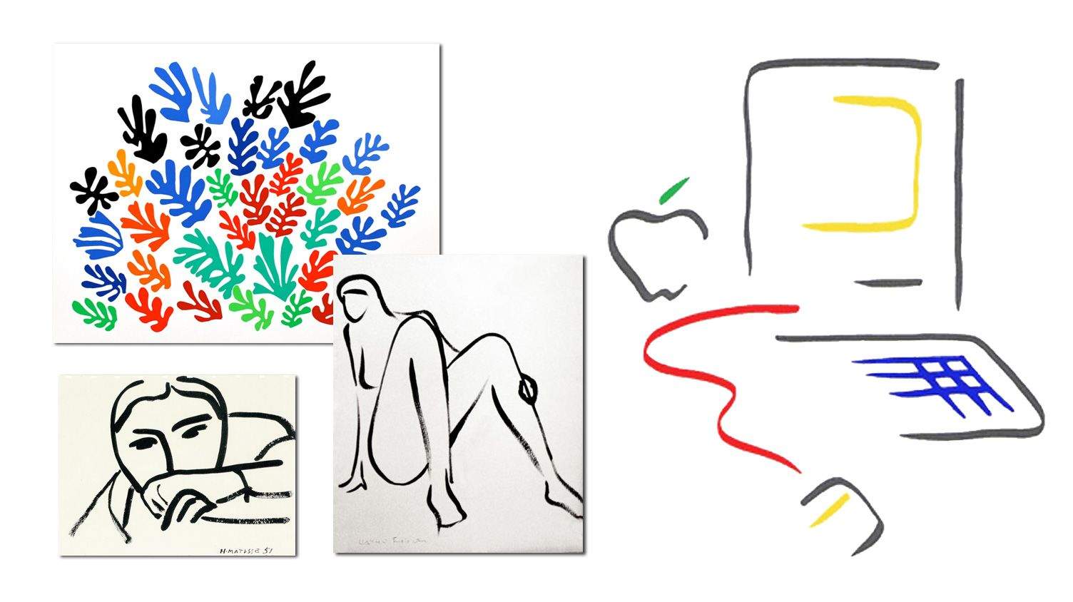
Macintosh 'Picasso' Artwork Was Actually Inspired By Matisse, Artist Says
The famous Macintosh "Picasso" trademark logo was developed for the introduction of the original 128K Mac back in 1984. A minimalist line drawingwww.cultofmac.com