trs96
Moderator
- Joined
- Jul 30, 2012
- Messages
- 25,543
- Motherboard
- Gigabyte B460M Aorus Pro
- CPU
- i5-10500
- Graphics
- RX 570
- Mac
- Mobile Phone
I've used Big Sur for a while now and still have mixed feelings about them. Some, but not all still really bug me when I look at them.
What is just OK
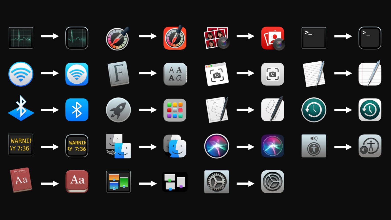
Making these simple "squircle" changes to icons from Catalina is not a big deal, but mostly just laziness from the graphic designers at Apple.


___________ And call it an icon Redesign !
The rounded squares are fine with me, actually prefer it for some of the Big Sur icons.
What I really like
The System Preferences icon looks really good with some depth added to it. Especially on a 4K monitor.
Terminal icon looks better as well as Activity Monitor.

What went from bad to worse !
The launchpad icon always looked silly to me now it has three rows of PlaySkool blocks inside a squircle.
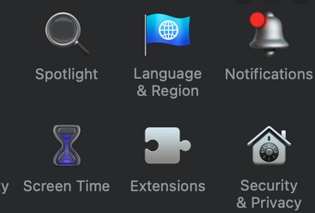
The Bell Notifications icon has to be the very worst of all. Looks completely out of place. Don't know if they will ever change it.

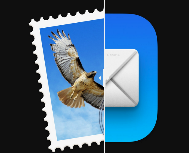
Last but not least I really dislike the change to the Mail app icon. The old one with the hawk was perfect, now it looks like something from Windows XP or ME. I know, it's used in iOS but why not leave the old version in macOS ?

What do you think ? Did Tim Cook and Apple lie to us, saying they've never planned to merge iOS and macOS ? That each OS would keep it's unique distinctions. How about just letting me keep one Classic Mail app icon if I want to ?
What is just OK
Making these simple "squircle" changes to icons from Catalina is not a big deal, but mostly just laziness from the graphic designers at Apple.
___________ And call it an icon Redesign !
The rounded squares are fine with me, actually prefer it for some of the Big Sur icons.
What I really like
The System Preferences icon looks really good with some depth added to it. Especially on a 4K monitor.
Terminal icon looks better as well as Activity Monitor.
What went from bad to worse !
The launchpad icon always looked silly to me now it has three rows of PlaySkool blocks inside a squircle.
The Bell Notifications icon has to be the very worst of all. Looks completely out of place. Don't know if they will ever change it.
Last but not least I really dislike the change to the Mail app icon. The old one with the hawk was perfect, now it looks like something from Windows XP or ME. I know, it's used in iOS but why not leave the old version in macOS ?
What do you think ? Did Tim Cook and Apple lie to us, saying they've never planned to merge iOS and macOS ? That each OS would keep it's unique distinctions. How about just letting me keep one Classic Mail app icon if I want to ?
Last edited:
