Contribute
Register

Discussing older Mac OS X Design Language

Status
Not open for further replies.
consistency, consistency across the board
To my eyes, these are only consistently boring, low quality icons that don't meet macOS standards.

Screen Shot 2022-07-28 at 2.19.58 PM.png


Screen Shot 2022-07-28 at 2.19.43 PM.png
 
Last edited:
He's a designer, consistency, consistency across the board. Both Steve Jobs and Sir Jony Ive knew/know the power of typography in strengthening a brand, also they hired an in-house Typography Designer a few years ago. Mainly because once Apple started upping the pixel density on their screens everyone else's Fonts would look awful and pixelated on anything Apple.

If I remember correctly, graphic-design is your speciality, isn't it Mr H? :thumbup:

I can understand consistency has it's place but sometimes it stifles creativity. Take a look at this:

Dock.png

You can easily spot my two, non-confirmist dock icons.

I've mentioned it before but I was a big fan of "CandyBar" by Panic Software, an app to change your icons using individual designs or libraries. Some of these were exquisite works-of-art. If you Google it and go to Images, you'll see. As a graphics pro I guess you'd love to be working on such interesting designs, instead of macOS blandness?

Yes, we can change our icons using Preview and the "Get Info" pane, but I guess it's too fiddly for most. And anyway, who cares? (Me!:D)

:)
 
If I remember correctly, graphic-design is your speciality, isn't it Mr H? :thumbup:

I can understand consistency has it's place but sometimes it stifles creativity. Take a look at this:

View attachment 552154

You can easily spot my two, non-confirmist dock icons.

I've mentioned it before but I was a big fan of "CandyBar" by Panic Software, an app to change your icons using individual designs or libraries. Some of these were exquisite works-of-art. If you Google it and go to Images, you'll see. As a graphics pro I guess you'd love to be working on such interesting designs, instead of macOS blandness?

Yes, we can change our icons using Preview and the "Get Info" pane, but I guess it's too fiddly for most. And anyway, who cares? (Me!:D)

:)
I studied it at university for 5 years, got good offers for work after… I’m a country boy and London or Manchester seemed very overwhelming for me at that time in my life, I didn’t get excited about ‘moving to the big city and making it’. I am into Typography, sure I have a couple of fonts on sale somewhere. So I packed it all in and moved to NY.
 
I studied it at university for 5 years, got good offers for work after… I’m a country boy and London or Manchester seemed very overwhelming for me at that time in my life, I didn’t get excited about ‘moving to the big city and making it’. I am into Typography, sure I have a couple of fonts on sale somewhere. So I packed it all in and moved to NY.

Didn't mean to pry. :thumbup: We all have stories, but share a common love of macOS or tinkering with PCs!

Back on topic (almost), for me there is a certain blandness to the icons of Big Sur and Monterey. Just a matter of personal taste, I guess. But I gave up my iPhone and went over to Android so I could have a more individual experience by customising, and not get locked out of anything by not conforming.

Back with Mavericks or Mountain Lion, or Lion there was still that graphics excitement we seem to have lost now.

:)
I’m glad I chose the path I did. I kind of feel the ‘fun’ has been missing from macOS recently, especially the last few years. Windows 11’s dock does have some nice icons, but look a bit basic.
 
Back with Mavericks or Mountain Lion, or Lion there was still that graphics excitement we seem to have lost now.
Well, I'm still crying for the loss of old style labels... and the rise of grey icons! Mavericks' Quicklook also dropped plenty of codecs (such as .mid), it also had a bug where occasionally it became blank... Well, to me, the best OSX ever was 10.6 — if not 10.4! ;)
 
As the subject of Typography and macOS has come up, can I just point out how ugly and sloppy the new 'About this Mac' window is!. I do like the format, I just wish they'd make it just a little wider so that words aren't left alone on a unnecessary second line.

Screenshot 2022-07-29 at 7.33.09 AM.png
 
Are you going to apply for a job at Apple ? We need you to fix these kinds of things. They're missing all the fine details that Steve wouldn't let them get away with.
I'm going to send an email right now to Cook, let him know that this sort of thing is unacceptable and un-Apple like and bring back the fun!.
 
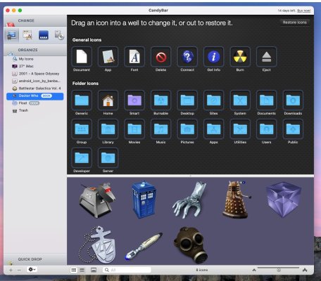
So, to "put my money where my mouth is" so to speak, I re-installed CandyBar from 2012, on my Big Sur system. Surprisingly it did run, but there are pretty serious glitches and it's not much actual use nowadays. BUT it does show what was possible back then.

With the window as you see it here, you had your library to the left - drag and drop to add icons or pre-built libraries - the preview pane to the bottom and, depending on the option you chose, the destination for the icons. Here you see a lot of my installed apps. Drag and drop. Job done.

Doesn't work now though ...

CandyBar.jpg

CandyBar2.jpg

Those were the days!!

:D
 
Status
Not open for further replies.
Back
Top