Contribute
Register

DARK Tonymacx86, the way it should have always been

Dark Tonymacx86


  • Total voters
    25
Status
Not open for further replies.
Joined
Jun 18, 2015
Messages
278
Motherboard
Asus X550LDV
CPU
i7 > Need full CPU model number > See Forum Rules!
Graphics
HD 4400
Mobile Phone
  1. iOS
I am a user that loves this forum, specially for the highly expert team that gives free support to users all over the world and tries to make them understand.
There's just one thing that drives me crazy and that is the horrible white and gray tones that you got us used to in this forum.
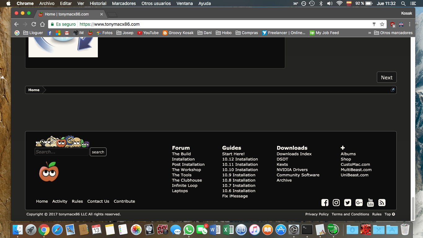
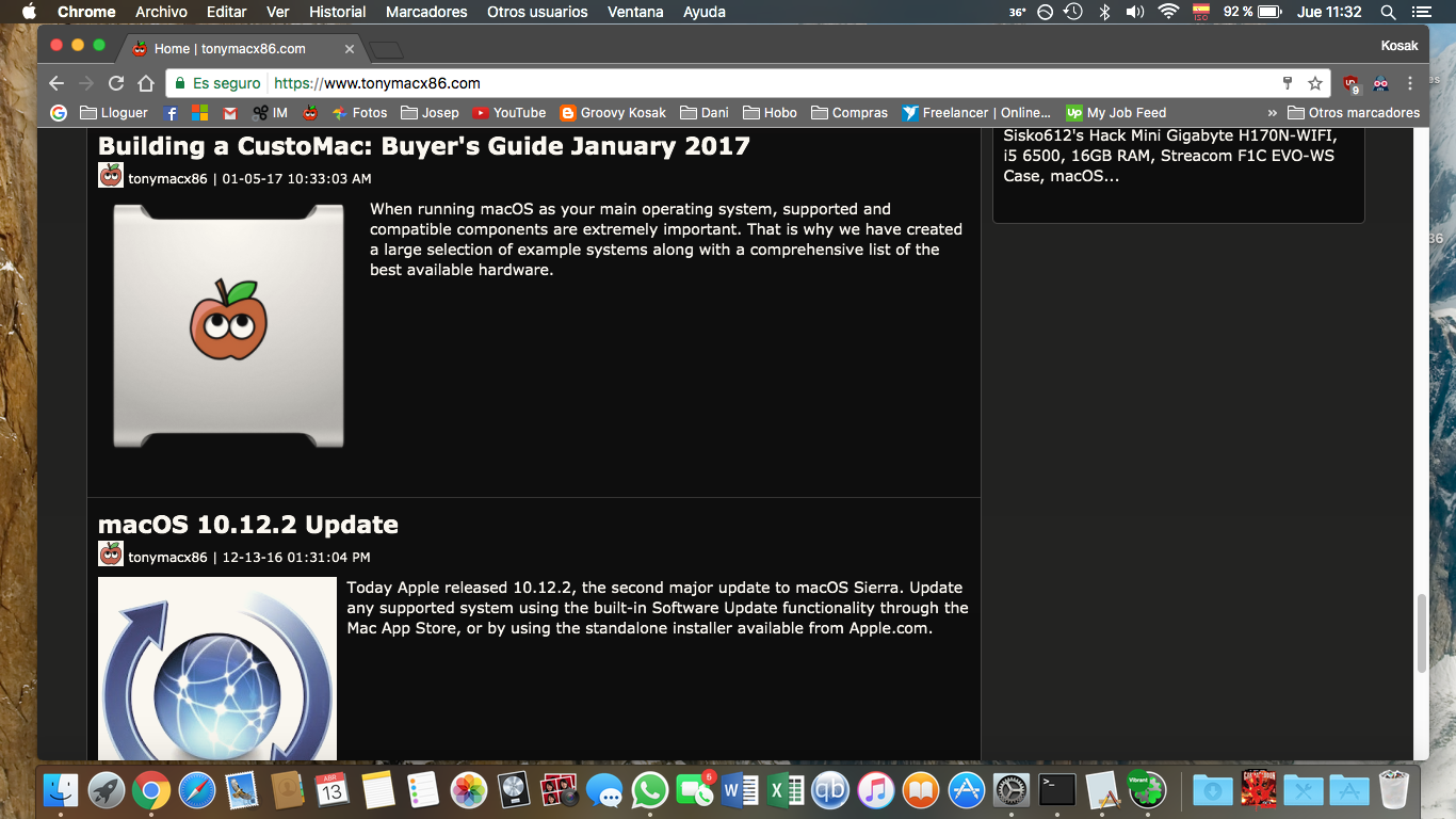
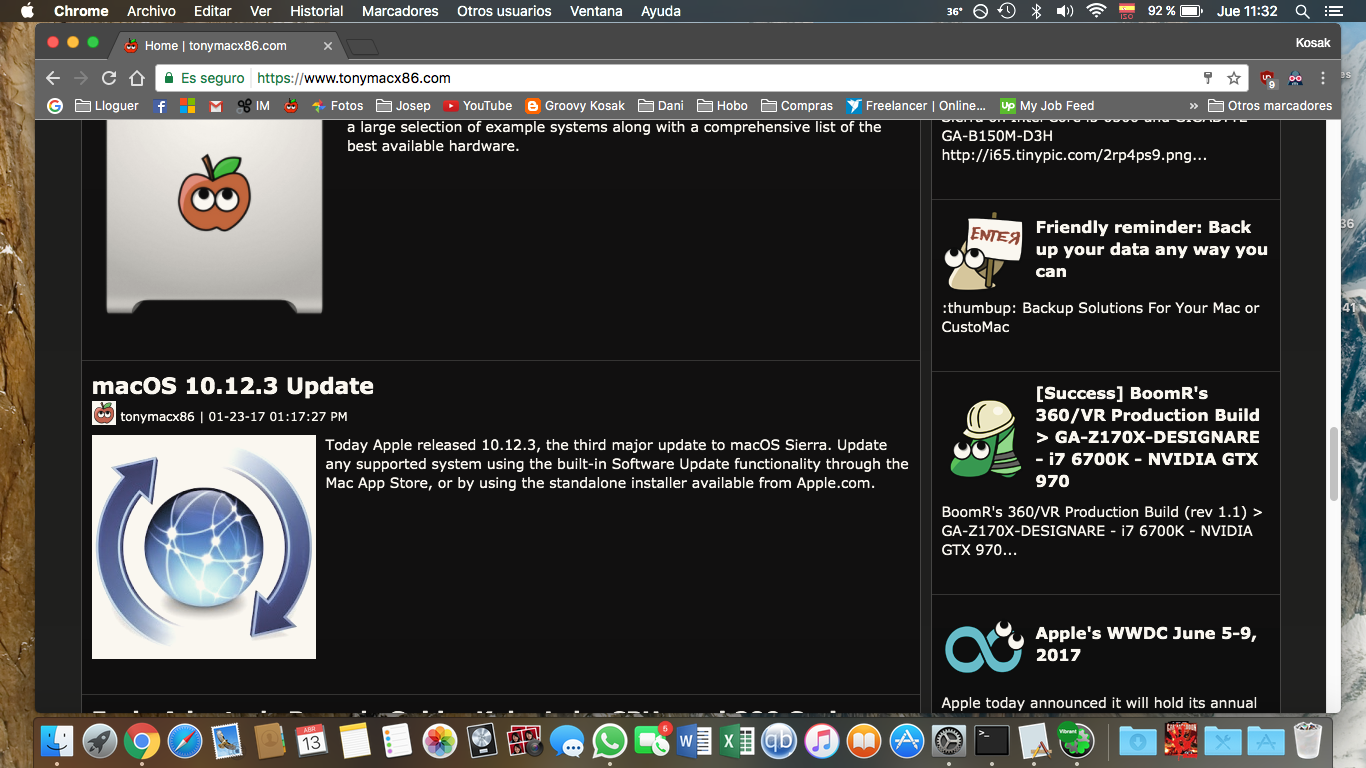
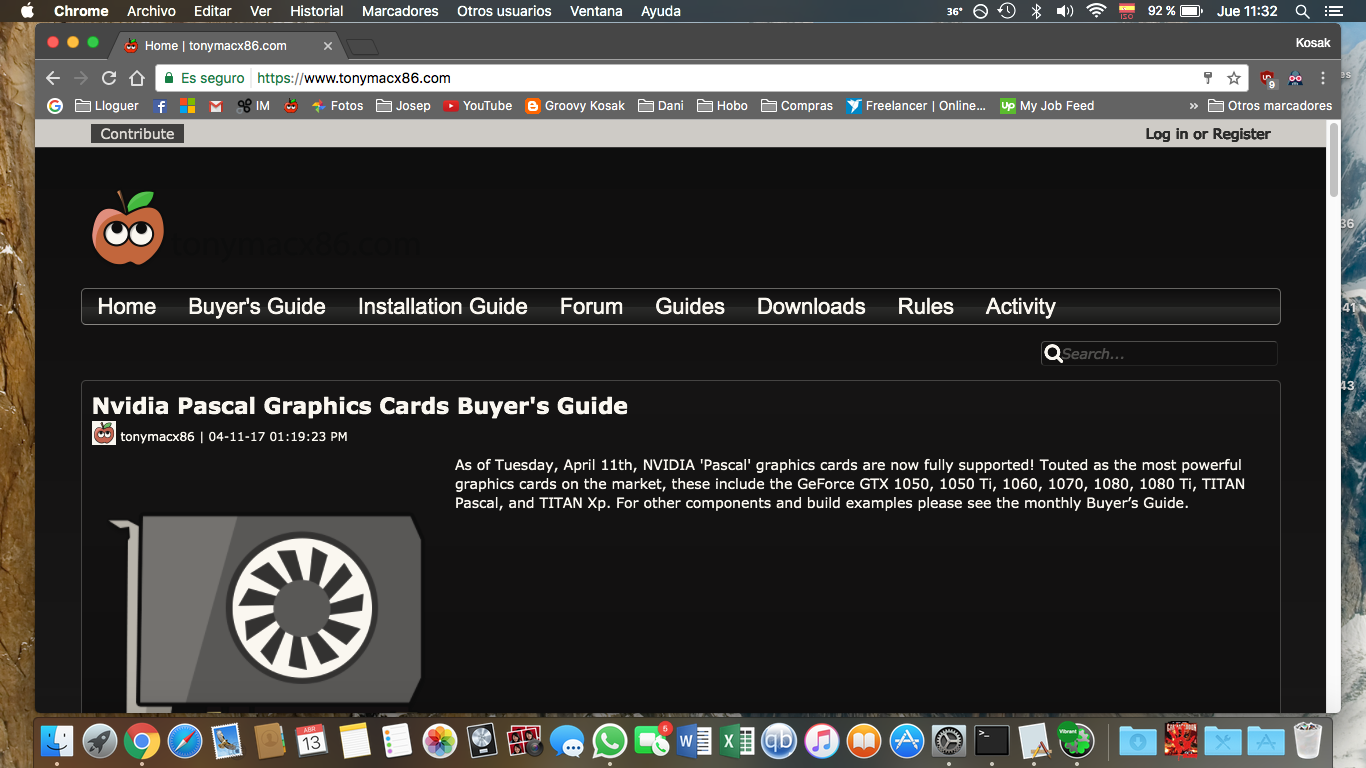
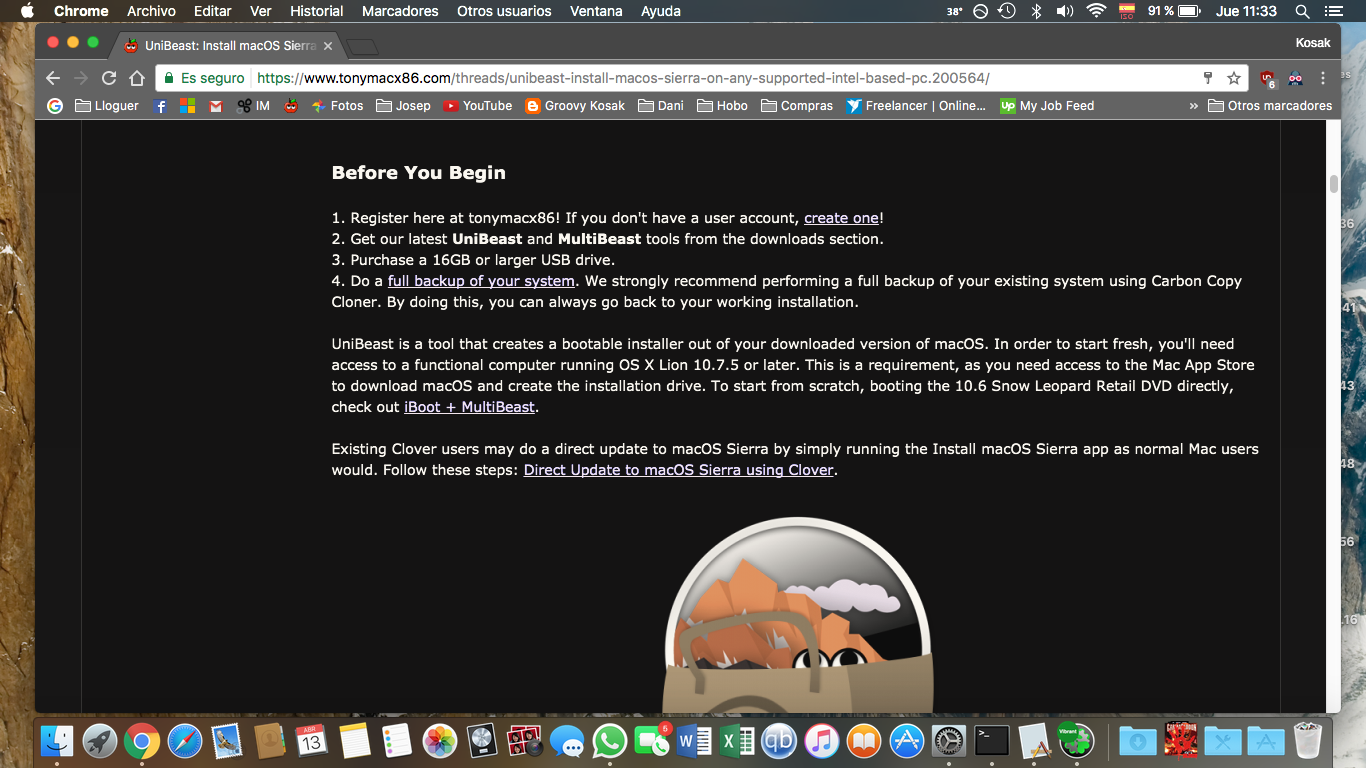
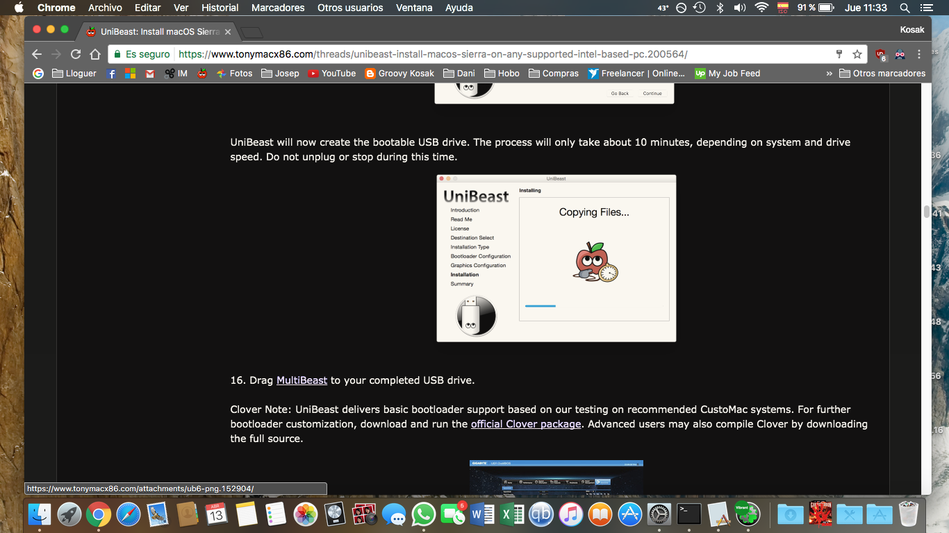
I am posting some screenshots so that you see how magnificent this forum would be and what a delight it would be to devour pages and pages of guides in a dark website
:cool: Nice for the eyes :)

Captura de pantalla 2017-04-13 a las 11.32.36.png
Captura de pantalla 2017-04-13 a las 11.32.41.png
Captura de pantalla 2017-04-13 a las 11.32.43.png
Captura de pantalla 2017-04-13 a las 11.32.48.png
Captura de pantalla 2017-04-13 a las 11.32.56.png
Captura de pantalla 2017-04-13 a las 11.33.16.png
Captura de pantalla 2017-04-13 a las 11.33.28.png
Captura de pantalla 2017-04-13 a las 11.33.33.png


i think this website could use some colour inversion. i know the answer already...
BUT WHO IS WITH ME????
:headbang:
 
So you write with a white pen on black paper?

Well if you prefer to keep burning your eyes with white pages go ahead mate. I made the poll to find out who shares or disagrees with my oppinion.
 
Well if you prefer to keep burning your eyes with white pages go ahead mate. I made the poll to find out who shares or disagrees with my oppinion.

I think your mockups look super cool- thanks for reimagining the site! :mrgreen:
 
I think your mockups look super cool- thanks for reimagining the site! :mrgreen:
It's an honor to know tonymac himself liked the idea! :)
Hope you guys spread the word a bit and see if we can get enough votes to get the website looking much more sleak and sneaky and cool, darker to give this website the feel it deserves
 
For those of us with poorish eyesight (not disabled, just poor), the black background and white text is horrible.

There are a number of studies as to why this is a bad idea, google for yourself.
e.g.
“People with astigmatism (approximately 50% of the population) find it harder to read white text on black than black text on white. Part of this has to do with light levels: with a bright display (white background) the iris closes a bit more, decreasing the effect of the “deformed” lens; with a dark display (black background) the iris opens to receive more light and the deformation of the lens creates a much fuzzier focus at the eye.”

This was quite interesting

https://www.webdesignerdepot.com/2009/08/the-dos-and-donts-of-dark-web-design/ (I note that the article is itself in black text on a white background)

as is this

http://graphican.com/index.php/user-experience-blog/60-why-white-text-on-black-background-is-a-no-no

However think about why virtually none of the very large companies, eBay, IBM, Apple, Microsoft have this style of a black background and white text. If there was an competitive advantage they would be doing it, there is none.

I'm sorry but this is a bad, bad, bad idea. Whilst it's nice as a proof of concept, I can tell you now that Tonymac will lose a significant number of readers as people struggle to read it. I will simply not bother to go to a website that makes my eyes bleed trying to read it.

Rob
 
Another web site I belong to used a black-and-gold styled theme for a brief period. I emphasize brief. Not that it looks bad, etc., it just gets hard on the eyes after a while.
 
I use a Google Chrome extension called Dark Reader which gives you a dark version of any website and you can actually tweak a few things if you can code in html :p
I just prefer to be able to in the day and bright sunlight read black text on a white background and so I switch Dark Reader off.. but myself being a night reader mostly i have the extension ON. I find myself many times in the night having to invert colours on my iPhone because I just can't cope wth white bloody backgrounds which hurt my eyes. I am happy to hear the experience and oppinion of everyone. And hearing this I ask wouldn't it be cool if there was a setting in the user control panel of settings to use light or dark version? It would definitely bring this debate to an end hihi
 
What a wonderful idea! Coincidentally, I came to this section of the forum to propose the exact same thing, after reading for an hour and a half at 2a.m. lol!

If it does hurt eyes, then let's just get some themes on so people can be given a choice and not be forced a certain way?

I am not disputing whether or not it's good or bad for your eyes - I am disputing it should be a choice of each user individually.

After all, we now have Mojave's dark mode - I imagine there'd be a few people out there that would like to match their desktop theme with the forum's.
 
White small, narrow fonts are tedios to read.

IF dark then the font shall be wide and less saturated, NOT 100% White. imo

Tahts my impression of the whole dark mode after beta testing Mojave for some time now.
I am back to Light mode until something get changed there.

For example the fonts of File Properties in Finder or the Safari FavBar are way to small and tedious to read.
The Light Theme is better readable that field, imo.

Except for coding , there i use a dark theme, but it rarely use the white on black ;)
 
Status
Not open for further replies.
Back
Top