Contribute
Register

Discussing older Mac OS X Design Language

Status
Not open for further replies.
It's the simple things!...

Screenshot 2022-07-30 at 9.34.16 AM.png
 
Last edited:
Some interesting comparisons between Snow Leopard and Ventura. I liked the iTunes logo.

Screen shot 2020-04-30 at 1.17.01 PM.png


Screenshot 2022-07-30 at 9.47.06 AM.png
 
The calculator icon in Big Sur and newer macOS versions gets my vote as one of the worst.
Right up there with the notifications bell in System Prefs. Safari has also degraded so much it looks nothing like the original version did. Looks more like a wristwatch than a compass.
1659392347049.png
1659392156562.png
 
Last edited:
For a long while Mac calculator had a bug where if you pressed buttons too fast, but well within the rate at ahich a human could click, it would just make up the input and performance arbitrary calculations. Today, you still can't copy/paste from calculator.

I could go on with a list of 5 obscene bugs in latest OS that have been around for generations, and my phone just does crazytown with certain input situations. UI race conditions and strange behaviors are too common and gross old bugs never get fixed. Try writing feedback to Apple for a pointless activity.

So argue about icons all you want, but my god...

In keeping with the topic, I think the design language of Apple SW went off the deep end around the time of Pages trying to target the web. Pages became a more and more elegant desktop publishing tool building upon Claris for years. Then MobileMe hit and the new web-centricity and the iWork / iHome suite was wrecked, and things got dumber and dumber. Today iTunes is a mockery of Soundjam MP: iTunes is an awful, ugly, eternally bug-ridden app that makes me feel like an idiot for using it.

And I will fiurther rant that with every OS generation, as many things that worked get broken as previous bugs get fixed. Apple SW may substanitally be going massively backwards. It's difficult for me to wrap my mind around because the feature space has become absurdly complex. I will end my gripe with the claim that if I don't find functionality to be dependable, I feel betrayed when more is added. I'll never hate Mac the way I hate Windows, but it's gotten really bad.

However, when I look at a decades of macOS visual aesthetic side-by-side, I sort of feel like I can see how their committees end up going the directions they have...

All this is magic to me now, no hope of understanding
 
I could go on with a list of 5 obscene bugs in latest OS that have been around for generations, and my phone just does crazytown with certain input situations. UI race conditions and strange behaviors are too common and gross old bugs never get fixed. Try writing feedback to Apple for a pointless activity.
This thread was never intended to document macOS bugs that have never been addressed. It was broken off from another thread that was going off topic. Only a discussion of how the graphics in OS X / macOS have changed in the past 8 years. We can complain all we want about anything Apple does or doesn't fix, in the end it makes no difference. They don't monitor these forums and respond to anything we gripe about.
 
The design language of OS X / macOS has changed significantly since 2014 when Yosemite gave us our first OS X version to borrow heavily from iOS. The dock went from 3D to 2D and became flat again, some icons changed completely, moving away from the abundant skeuomorphism in past OS X versions. In this thread you can voice your opinions about what you like from past versions compared to what we have now in Monterey/Ventura.

This iTunes 12.2 icon with the color gradient is my favorite iTunes icon of all time. Now it's just red, kind of like the 2014 12.0 version but in the "rounded square" treatement that all of them get today.

View attachment 552053
Was glad when they got rid of the CD icon many years ago.

View attachment 552054
I liked the shiny pill style era best, circa 2010-2012. Looked nice, and made the difference between plain text items and something you could click on clear. Nowadays, it's all dark and grey and low contrast. Bah.
 
Steve Jobs introduces Mac OS X, San Francisco 2000. Later in the 9 1/2 minute video, Steve talks about the Design elements in the OS X user interface. In part 3 Steve introduces us to the Dock. You can see Steve's enthusiasm when talking about the interface and how keeping it simple is key.


Last edited:
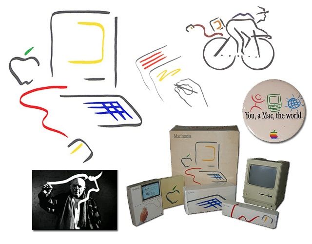
Over the years Apple has lost that 'Cool' factor, they're becoming, dare I say it... Boring!. The 'Picasso' style branding is iconic and related products can now fetch thousands on eBay.

Screenshot 2022-08-03 at 7.51.00 AM.png


Over the years Apple has lost that 'Cool' factor, they're becoming, dare I say it... Boring!. The 'Picasso' style branding is iconic and related products can now fetch thousands on eBay.

View attachment 552505


I agree. :thumbup:

What's more is that the "Think Different" campaign really worked, for me at least. Highlighting prominent "boat-rockers" and innovators.

Now it is rather "bland" and "corporate". Which is a shame.
 
Should I buy the M2 Air or the rare Vintage 'Picasso' Floppy 10 disc box... that's a tough one!.

Screenshot 2022-08-03 at 8.14.28 AM.png
 
Status
Not open for further replies.
Back
Top